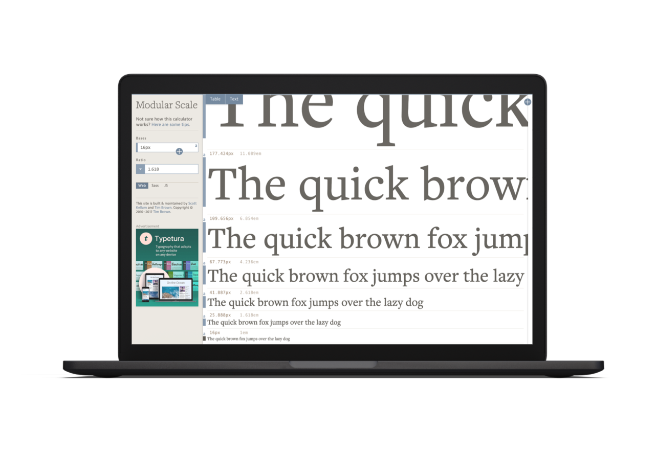
Why use it?
If we use modular scale correctly it helps speed up our design making decisions, it frees up more time to focus on other areas of the design, allowing us to really finesse our work. It also has a positive impact on our design compositions, layouts, and vertical rhythm. This improves readability to give your work that professional finish clients are looking for.
How to use it
There are a couple of deciding factors to determine what scale you want to roll with. Firstly, we need to be mindful of the rules/laws surrounding accessibility. The BBC describe accessibility as:
The word used to describe whether a product (for example, a website, mobile site, digital TV interface or application) can be used by people of all abilities and disabilities. For instance, a website is accessible if all people, including disabled and elderly people, can use it.
With this in mind we need to consider font sizes for people with visual impairment, most articles will recommend a font size no smaller than 16px but this may vary depending on the font family you’re working with.
Secondly, we need to keep in mind the screen size of the viewer. For example, a scale using the golden ratio will work really well for desktop but won’t have the same impact on mobile. Please avoid using multiple scales for one view port as this defeats the object.
Final thoughts
I appreciate this is a short and sweet article, but hopefully it makes sense. The question is: Where does it go from here?
If the rules of modular scale feel limiting, it really isn’t. If anything it’s limitless; we have a wide range of scales to choose from, varying base fonts to pick, and this will naturally have an impact on font size options.
Some scales work better for different device sizes so it won’t be uncommon to see multiple scales residing in one website. However, using multiple scales for one view port defeats the object of modular scale, and I can’t stress this enough.
So, the next time a client asks you to increase the font size a bit you should always take these comments on board, but now you have solid rationale for your decisions. Remember, this also presents you with an opportunity to educate your clients and better yourself as a designer.


