White space, also known as negative space, is an essential element that refers to the areas of a design that are intentionally left blank. While some may view it as an empty area to fill, white space serves a crucial purpose in UI design, contributing to its visual appeal, readability, and usability.
Design principles: White space
The importance of whitespace in UI Design

What is whitespace?
Common preconceptions
Some people may not like white space in UI design for a few reasons. Firstly, they may believe that white space is “wasted” space that could be filled with more content or elements. They may think that more information or features can be added to the interface and that white space is a missed opportunity to do so.
Secondly, people may be concerned about the perceived value of the design. They may think that an interface with more elements or content appears more valuable and substantial than one with more white space. They may fear that users will perceive a design with too much white space as unfinished, incomplete, or lacking substance.
Thirdly, people may have a preconceived notion of what a website should look like, based on their own experiences and preferences. They may expect a design to have a certain density of content or a particular style, and white space may not fit within that framework.

Improved Readability and Comprehension
It can play a significant role in improving readability and comprehension of textual content. Ample spacing between lines of text, known as leading, and between paragraphs enhances legibility by preventing crowding and overlapping. It allows users to read the content comfortably without straining their eyes. Moreover, white space can be strategically used around important text or headings to make them stand out and draw attention. Optimizing readability can contribute to effective communication and information absorption.
Enhanced Aesthetics and Branding
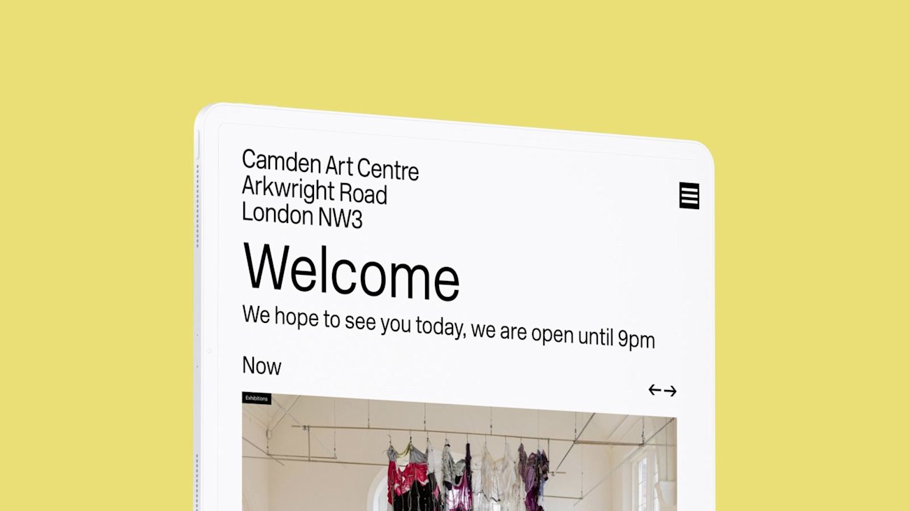
It’s a powerful design element that contributes to the overall aesthetics and branding of a website or user interface. It can create a sense of elegance, sophistication, and minimalism. By using white space strategically, designers can create a sense of balance and harmony within the layout. It adds a sense of breathing room and elegance to the design, making it visually appealing and memorable. It can also help emphasise the branding elements and make them more prominent, such as logos, taglines, or key visuals.
By leveraging white space effectively, designers can establish a unique and cohesive brand identity.
Improves usability
It’s important to note that these concerns are not necessarily rooted in best practices or user needs. White space can be an incredibly effective design element that enhances readability, focus, and visual hierarchy. White space can help guide the user’s attention to important elements on the page and can make content easier to scan and digest.
Working as a partnership
We foster a strong collaborative relationship with our partners, ensuring a deep understanding of their unique needs. Through this close partnership, we dedicate time and effort to provide expert guidance, ensuring that their user interface (UI) not only aligns with their project goals but also surpasses their expectations. Good designers are the ones who listen and take this on board and the best designers educate. Ultimately, the goal of UI design is to create interfaces that are effective, efficient, and enjoyable for users. While it’s important to take feedback and preferences into account, designers must also prioritise the needs of the user and ensure that the design supports their goals and tasks.


